

Tips for Designing an Effective Landing Page
Industries worldwide have moved their marketing campaigns online. Landing pages help businesses create effective marketing strategies to promote products and services. A landing page is an important part of the design development process and aims to entice visitors and drive them further down the conversion funnel. Landing page design needs to be flawless, and that’s what we’re going to talk about in this article. How can you design a landing page that’s effective enough to convert visitors and get them to purchase or subscribe
Tips for creating an effective landing page
Provide discreet content
The content on your landing page must be to the point, highlighting your unique value proposition (UVP). The content you offer will depend on the type of product or service you’re selling. Remember that you have approximately eight seconds to convince users that your offer is worth pursuing. Excessive information can overwhelm visitors and make them leave the page immediately. Speak to your audience using plain language and tell how you can make their lives better.
Here are the top 5 highest converting text elements.
Heading
The heading is the first text that your visitors see. It’s one of your first opportunities to influence your conversion rate. Use a heading that clearly states the biggest benefits that your product offers. In the heading, tell your visitors exactly what they can get on your landing page.
Subheading
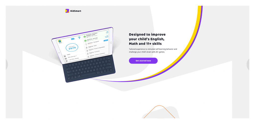
The most effective landing pages indicate what’s being offered with the heading and use the subheading to further explain the offer and share the UVP. Subheadings may showcase whatever you’re offering in a new light. Some landing pages choose to push their value propositions to the heading and use the subheading to discuss the actual offers.
In one of our projects shown below, you can see how the subheading complements the heading. When users land on the page, they clearly understand what the service does and can click the call-to-action button right away.
Call to action
Provide captivating and clickable call-to-action (CTA) buttons that encourage visitors to purchase, sign up, request a demo, or do something else. The best option is to place CTAs at the top and bottom of the page so users don’t have to scroll all the way up to click. Or you can add a floating CTA button that’s always visible. Your CTA buttons will look nice if they change color or include animations to entertain visitors, adding to the overall impression your brand aims to create.
Double-check that your message in the CTA and the heading of the landing page correspond. If the heading reads differently than your call to action, it may lead to confusion, leaving visitors wondering whether the CTA is linked to the wrong page. Eliminate all confusion and make sure your text content reflects what you’ve promised in your call to action – and vice versa. If there’s a deliberate catch in your CTA (e.g. no free trial), you’ll lose your users’ trust.
Another project that we’ve worked on features a CTA button that’s textually and logically linked to the headings and subheadings. What’s more, it has a nice animation to engage visitors. Registered users can simply click the sign-up button in the upper right corner to proceed with the site.
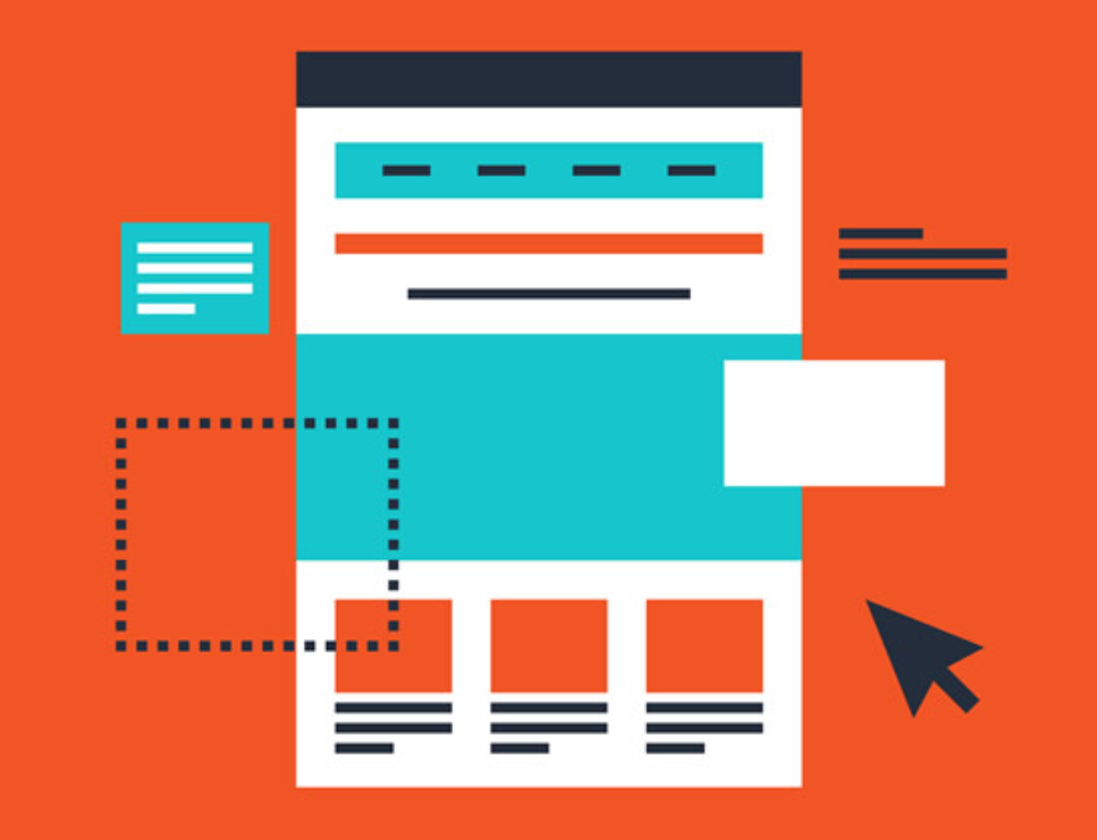
Keep to a simple layout
A good landing page design is minimalist and attractive, presenting information non-intrusively. To avoid sidetracking people with redundant visual elements, use a clean, simple design with plenty of white space that keeps people on your product and call to action. Choose a big font to make it easy for visitors to read and understand what your landing page is all about. Also, make sure your design doesn’t increase the page loading time.
Сheck the layout of your page at different resolutions to make sure that even people with older monitors will be able to see your heading and CTA without scrolling. And be sure to check how your layout is displayed on mobile devices.
Most visitors are likely to scroll down for more information, so don’t be afraid to add blocks that show when the page is scrolled.
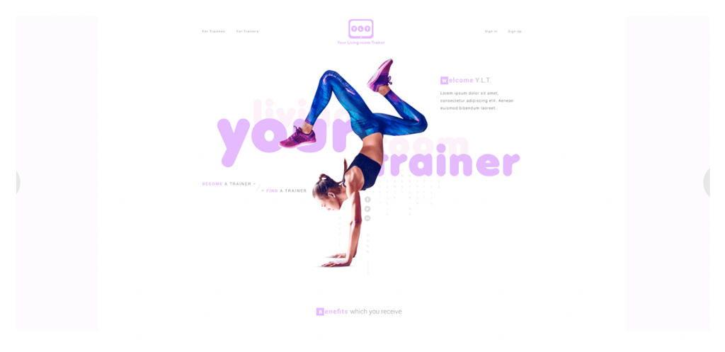
Not so long ago, we released an application called Your Living-room Trainer that applies minimalist design and white space to make the landing page light and help users focus on what the service offers,